Today we’re excited to post a guest post from our friends over at Pixel Union, the leaders in designing and building Shopify themes:
It’s 2018, and the future is bright — especially if you run an online subscription business.
With rapidly improving technology, shifting consumer demographics and preferences, and a seemingly infinite supply of neat things to sell, there’s never been a better time to start a new subscription business (or add recurring orders to your existing business).
But the road to success isn’t all sunshine and rainbows. While subscription-based selling is one of ecommerce’s fastest-growing segments (up nearly 3,000% over the past three years), competition is heating up, meaning businesses have to work harder to set themselves apart.
As a Shopify merchant, one of the main factors that can make or break your store’s success is your theme. After all, it only takes about 50 milliseconds for customers to form an opinion of your site. If they don’t like what they see, they’re not going to stick around.
That’s where we come in. As Shopify Partners and makers of some of the platform’s most popular themes, we know a thing or two about first impressions — and today our friends at Recharge have invited us to share some of what we’ve learned with you.
Here’s what to look for when choosing a theme for your subscription business.
A clean, uncluttered homepage
Your homepage has a big job. As the most visited page on your store (typically receiving more than 50% of total traffic), it’s not enough to simply catch visitors’ attention. Your homepage must identify needs, convey benefits, build trust, and guide customers toward a desired action.
A tall order, for sure, but the truth is: it actually isn’t that hard to pull off.
Take Bespoke Post, a curated box for “guys who give a damn.” Looking at the above-the-fold design and content, there’s nothing particularly avant-garde. You’ve got a fun explanation of the concept, a visual representation of what they’re offering, a clear call-to-action, and a trust-building testimonial from a reputable source. That’s it!
Unlike themes with busy slideshows or multi-image layouts, themes with a single, static hero image force businesses to be selective. As the Nielsen Norman Group explains, a simpler design runs counter to the “false sense of security” offered by more complex designs, encouraging merchants to “choose something that’s powerful and demonstrative.”
Stackable storytelling sections
With just one image and a few lines of text in your hero area, you might wonder how you’re going to find room to describe your product and sell it to customers.
The answer? Scroll down.
You’ve already engaged visitors with an enticing visual and message. Now it’s time to keep their attention with informative and scannable “at-a-glance” content.

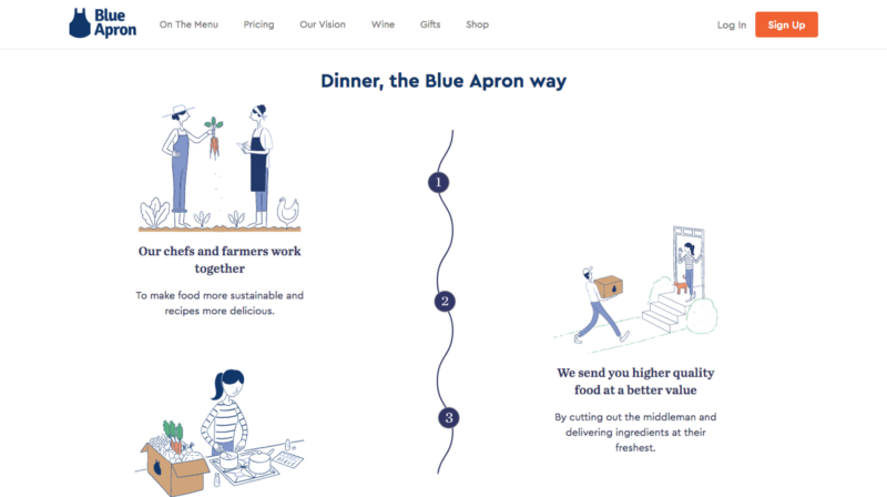
The folks at Blue Apron do a stand-up job of of this, thoroughly explaining their service without overwhelming users with huge blocks of text. Using illustrations, annotated lists, and user-generated content, they’ve effectively told the farm-to-table story of their products, conveyed the convenience of their service, and built a strong community around their brand.
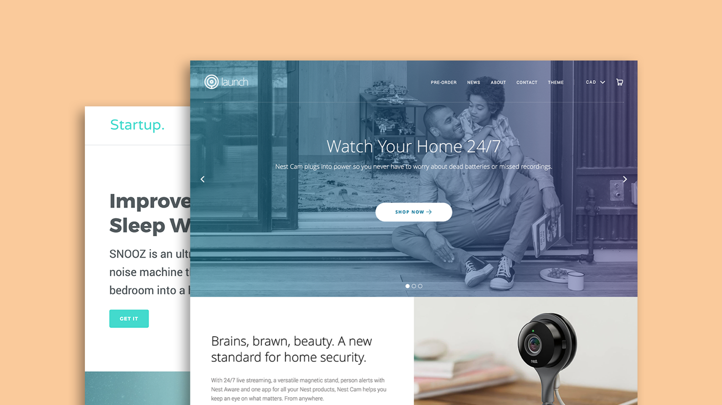
When choosing a Shopify theme, pay attention to the types of “stackable storytelling sections” included. For example, our Startup theme (optimized for single-product stores and great for subscription businesses) includes 15 customizable, repositionable sections, including videos, social feeds, testimonials, and promotions.
Get creative and build a one-of-a-kind experience for your customers.
Social selling features
With the average person spending nearly two hours a day on social media, and three out of four people relying on social networks to guide purchasing decisions, it’s safe to say social is non-negotiable for merchants in 2018. This is even more true in the subscription industry, where user demographics skew heavily towards millennials.
One company that hits it out of the park when it comes to social is Loot Crate, a “fan-powered subscription for geeks and gamers.”

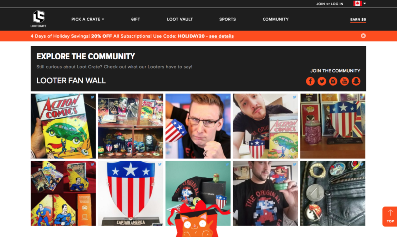
Loot Crate integrates social media into their store in a couple of ways. First is their “Looter Fan Wall” — essentially a live feed of the company’s Instagram mentions. This gives prospective subscribers an idea of the popularity of the items they’re considering, as well as a window into how people are using and enjoying them “IRL.”
Another thing they’ve done is integrate customers’ YouTube videos into their homepage. These videos span everything from unboxing to game battles to vlog-style product reviews, and serve to entertain, educate, and subtly (and probably quite effectively) convert.
To emulate Loot Crate’s social prowess in your store, look for a Shopify theme with baked-in social feeds. For example, our Launch theme (another good choice for subscription-based businesses) includes multiple options for integrating Instagram and Twitter feeds into your homepage. It’s a great way to build community and drive sales.
Parting words
By now, you should be well on your way to picking the right Shopify theme for your subscription business. We’ll leave you with one last piece of super-important advice: when choosing a theme, pay close attention to the reputation of the developer.
Read the reviews to ensure that the code is up to standard and the customer support is consistent and friendly. Preview the store with your own content and products to see that it jives with your brand and isn’t missing any must-have features. Due diligence might not be the most thrilling part of launching your subscription business, but it’s a hugely important one.
Do you run an online subscription business? What did you look for when selecting your theme? Let us know in the comments!


