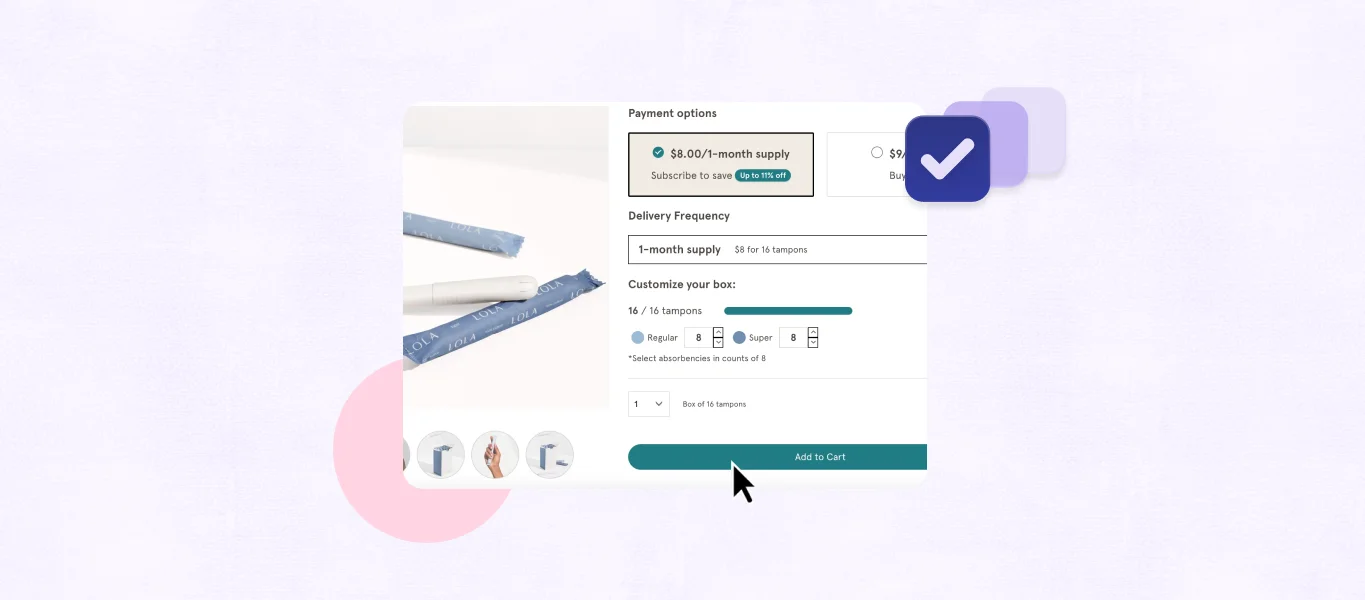
For any brand offering subscription options, an effective subscription landing page can be a helpful conversion driver. A subscription landing page should be an easy and engaging way for customers to understand the benefits of subscribing, find answers to their pressing questions, and learn how they can sign up.
In this blog, we’ll break down the value of a well-done subscription landing page for Health & Wellness brands before diving into a few examples from Recharge merchants.
Key takeaways
- Subscription landing pages are an essential one-stop-shop for potential customers to understand the value of your subscription offering before they commit to recurring purchases.
- A strong subscription landing page especially makes a difference in the Health & Wellness vertical to educate customers, make it easy for customers to see long-term results by subscribing, and by helping customers build their everyday routines.
What a good subscription landing page accomplishes for Health & Wellness brands
For Health & Wellness brands specifically, having a good subscription landing page can make all the difference in encouraging customers to make recurring purchases with your brand. An effective subscription landing page can provide opportunities to educate potential customers, encourage long-term use, and become part of customer routines.
Educate potential customers
Health & Wellness products often require some form of education. What pain point is the product trying to solve? How should the product be used, and how often? What types of results should the customer expect after using the product? A subscription-landing page is a great opportunity to inform potential customers about your product and make it easy for them to buy then and there.
Encourage long-term use
Health & Wellness products often require long-term use to see or maintain results. Subscriptions are a convenient way for customers to receive the products that they love without having to remember to re-order. A clear and enticing subscription landing page will convey the value of subscribing to that specific product as a cost-effective, no-stress way to have self care delivered directly to your door.
Become part of customer routines
The brands that stay on top are the ones that ingrain themselves into their customers’ everyday lives. Subscriptions make it easy for Health & Wellness brands to become building blocks in their customers routines.
Recharge merchants with solid subscription landing pages
Now that we know some of the ways that Health & Wellness brands can benefit from thoughtfully-designed, user-friendly subscription landing pages, check out these four examples of Recharge merchants that are making the most of their subscription landing pages.
- Natalist
- DripDrop
- Sports Research
- Populum
Natalist speaks directly to their audience
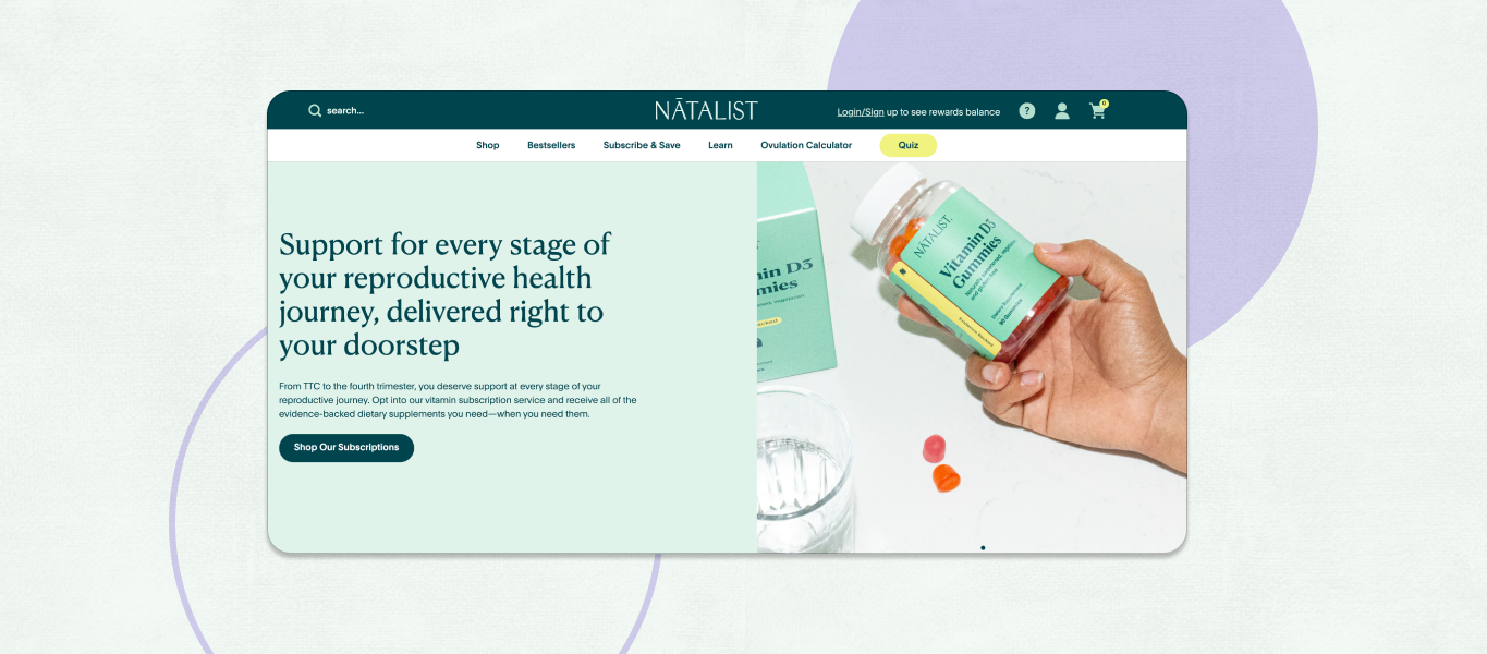
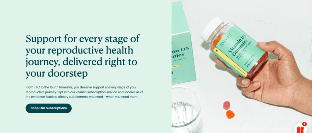
Natalist’s subscription landing page is tailored to their customers, centering their mission of “supporting your reproductive journey with evidence-backed fertility, pregnancy, and postpartum essentials.”
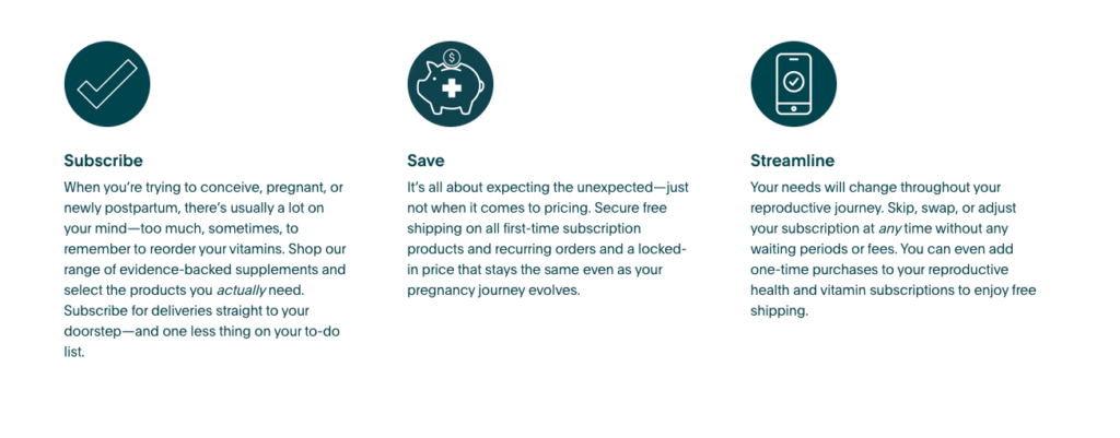
Natalist lays out how their subscriptions can directly address some of their customers’ pain points in their “Subscribe, Save, Streamline” graphic. Each point communicates benefits of subscribing that take into account the fact that customers are all in various stages of being on a reproductive journey:
- Subscribe: You have a lot on your mind during this time in your life. By subscribing, you don’t need to worry about remembering to reorder your vitamins.
- Save: You’re going through a lot of changes throughout your reproductive journey, but pricing is one change you don’t have to worry about with us.
- Streamline: Your needs will change, so you will need a subscription that can change with you. We can help with that.
DripDrop keeps things easy with intuitive navigation
DripDrop’s landing page is proof that sometimes less really is more when it comes to text. In under 100 words, DripDrop tells you everything you need to know about their subscriptions in an ultra-navigable page.
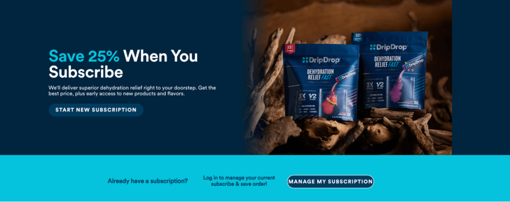
DripDrop’s subscription page emphasizes the most compelling benefit of their subscription program at the very top of their landing page, which reads “Save 25% When You Subscribe” in large type. On their very first glance, customers that visit the page understand the value of subscribing, and can even respond to the “Start New Subscription” call to action with one simple click.
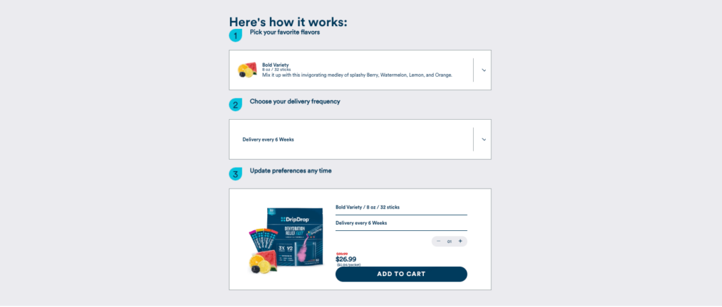
Further down, DripDrop simplifies the subscription process for users with their interactive “Here’s how it works” section. Users simply pick their favorite product flavors and a delivery frequencyThen DripDrop creates their custom subscription pack, displays their subscription savings, and enables them to add to cart. Simple as that!
Sports Research emphasizes flexibility
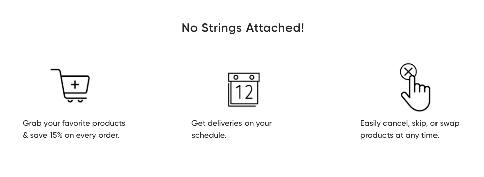
Sports Research uses large, high-quality images on their subscription landing page that make it visually interesting without distracting from the text. Sports Research helps address potential customer concerns right away with their “No Strings Attached!”section. Potential customers see that they can “easily cancel, skip, or swap” and will have the flexibility to “get deliveries on your schedule.”
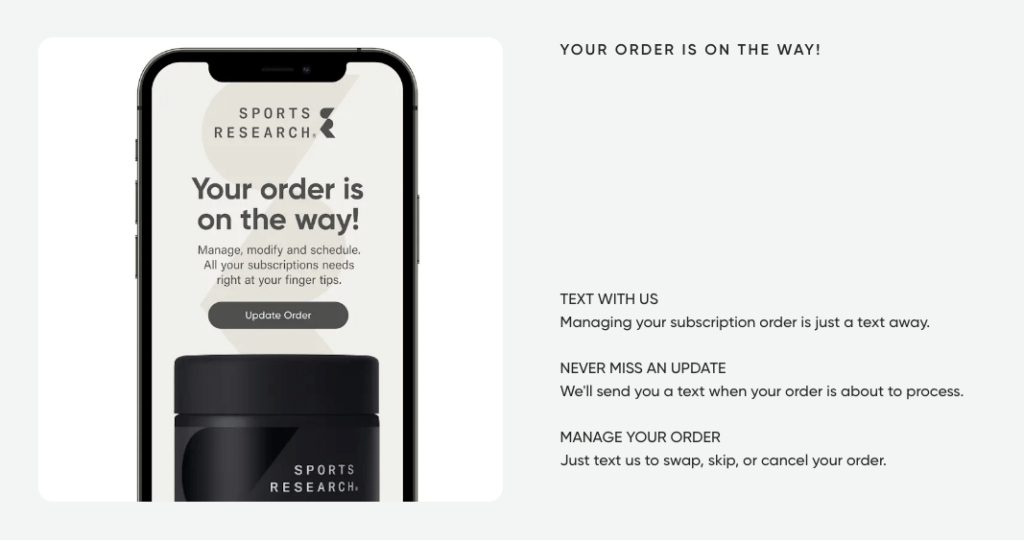
Sports Research also highlights the convenience of their text features, demonstrating how simple it is to manage your subscriptions.
Populum educates in a newcomer-friendly way
Populum uses their subscription landing page to make subscriptions to their line of CBD products feel accessible, allowing customers to more easily understand each product and how to use it, which helps keep them from getting overwhelmed.
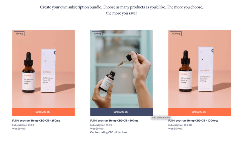
Website users can see the products laid out right on the landing page and can hover over each product for a one-sentence description, like “Our bestselling CBD oil tincture” or “Fast-acting relief for your muscles and joints”.
Populum has also embedded a video on their page titled “How A Retired Nurse Used CBD.”In the video testimonial, the retired nurse explains what she uses Populum for, goes through her products, and explains their effects. This engaging addition educates potential customers who might not be as familiar with the uses of CBD.

At the bottom of the page, Populum has embedded all of the reviews left by real subscribers. By making all reviews easily viewable on their landing page, they are approaching potential subscribers with honesty and confidence (and they have all the 5 stars to prove it!).
Elevating subscription experiences with an effective landing page
By writing a thoughtful, intentional subscription landing page, our Health & Wellness brands can convey the value proposition of their subscriptions, empower customers to sign-on for lasting results, and ensure that their brands become part of lasting wellness routines.
