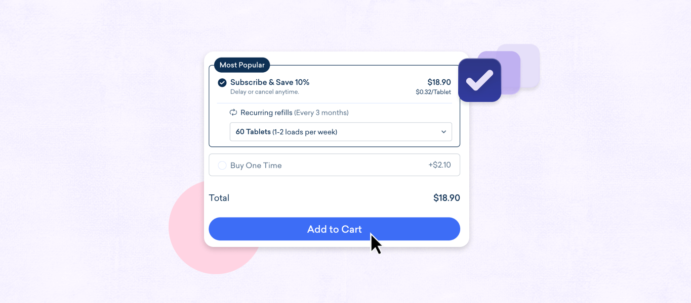
Clicking Add to Cart might be one of the briefest steps in the shopping journey, but it’s a pivotal moment for any online business to maximize conversion.
Optimizing components of your site experience immediately before and after it—including the cart itself, the checkout flow, and conversion-relevant elements of the product info page—is crucial to the site experience and your bottom line.
This blog uncovers four key ways ecommerce brands can boost sales and enhance their store experience.
Key takeaways
- Streamline your shopping cart design and checkout experience to make a big difference in conversion.
- Offer complementary products at key moments to increase average order value.
- Regularly track cart performance metrics to identify areas for improvement on your site.
How your company can maximize your cart performance
1. Optimize shopping cart design & management
Start with the basics. The best thing you can do for your store is to remove all obstacles preventing customers from clicking that buy button. It may feel obvious, but it’s hard to overstate the importance of an easy purchasing experience.
The Add to Cart buttons on your product pages should be prominent, easy to find, and obviously clickable—any difficulty with a step as simple as adding a product to cart may result in a shopper abandoning their purchase.
The shopping cart page itself should be equally navigable: eliminate visual clutter to keep the focus on the products, minimize frustration, and minimize cart abandonment.
With a smooth path all the way from the Add to Cart button to a complete checkout, you’ll likely experience a notable boost in conversion.
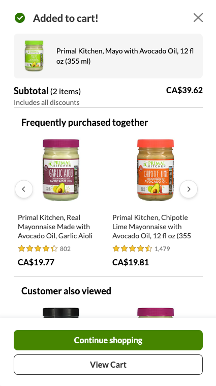
Don’t forget to consider the experience between clicking the Add to Cart button and viewing the cart itself. There are many different kinds of carts which can make it easier to show your customers the products they’ve added, or visually engaging opportunities to offer tailored product suggestions.
An example of this is Primal Kitchen. They display their cart in a side panel, giving them ample space to optimize its contents for cross-selling opportunities as soon as a customer clicks the add to cart button.
2. Cross-sell & upsell on product pages & more
A customer clicking the Add to Cart button provides valuable information about their intent to buy an item. Use it!
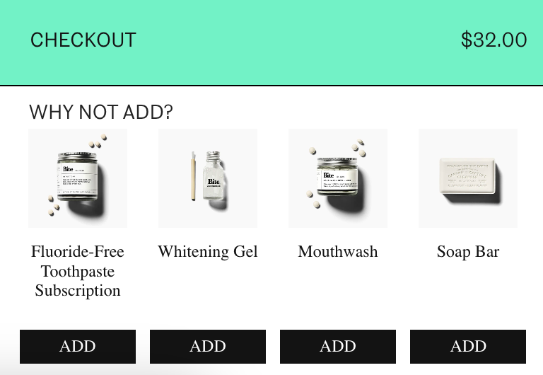
Take the opportunity to cross-sell, or offer related, complementary items to round out their purchase and encourage them to add items to their purchase. Cross-selling is the perfect way to expose shoppers to different parts of your catalog—they may not even know what options you offer, or which ones pair well with their first item.
Try displaying cross-sells either directly on the product info page or in a popup after the customer adds a product to their shopping cart (and don’t forget to include an Add to Cart button there too, so users don’t need to navigate to individual product pages to add products).
And if they decide on products that come with multiple feature sets at different price points, they may benefit from upgraded versions, so consider making personalized upsell offers.
Personalization is paramount
Cross-selling and upselling are both potentially effective tactics, but to be valuable, they need to be thoughtful. Whenever possible, offer options relevant to the item being purchased or to the customer’s profile—or both.
When not personalized, cross-sells and upsells can feel transparent or pushy and are just as likely to alienate customers as they are to increase sales.
3. Make it simpler for customers to add to cart
A cumbersome checkout process can be a major deterrent for customers looking to complete their purchase. To minimize cart abandonment, prioritize a streamlined and user-friendly process to encourage customers to add to cart.
First, make checkout friendly to both new and returning customers. Not all shoppers will already have an account with your store, and not all will want one (at least not at first). To make the first order easy and subsequent ones more likely, offer a friction-free guest checkout option that doesn’t require signup.
Similarly, you’ll find a wide array of payment preferences across your customer base. Try adding support for some popular one-step checkout options—Shop Pay from Shopify, Amazon Pay, and Apple Pay, to name a few—to make it nearly effortless for customers to buy your items and complement the Add to Cart button.
And don’t discount the effect that simple design decisions can have. Displaying progress indicators throughout the checkout process helps users track their movement toward a completed purchase.
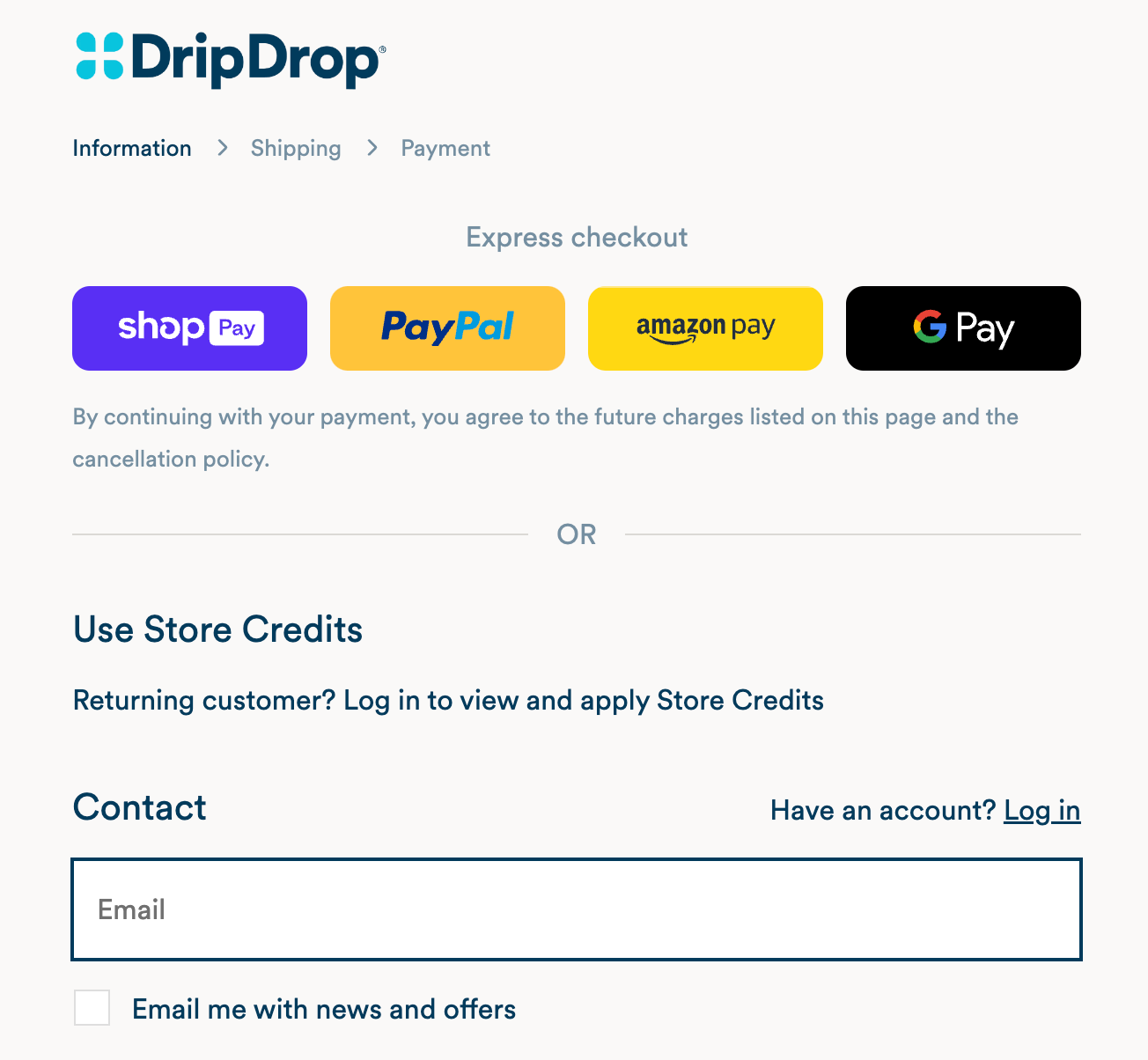
Tip: payment doesn’t have to be complicated. Ecommerce platforms like Shopify offer native support for plenty of payment options. Check with your platform of choice to see how you can support shoppers.
4. Measure, iterate & improve
Ongoing assessment of your brand’s cart metrics is essential. Different shopper cohorts will respond differently to all of these tactics; to make informed decisions and avoid overinvesting in initiatives that don’t return sales, you need to track how each part of your shopping journey performs.
By tracking stats like cart abandonment rate, average order value, and conversion rate, you can gain valuable insights into customer behavior and identify areas for improvement on your site. The power of data doesn’t end at tracking: businesses should utilize what they’ve discovered to make strategic decisions, test, and iterate on the results.
Think beyond the Add to Cart button
Add to Cart is more than just a button on a page—your business depends on it, and it represents a critical opportunity to engage customers and drive sales. By optimizing the shopping cart and checkout experiences, embracing cross-selling and upselling opportunities, and monitoring cart metrics, your business can unlock the full potential of the shopping journey.
Sources
[1] The Keys to Abandoned Cart Recovery and Reducing Lost Sales (BigCommerce)
