In this series, we’re talking all about how ecommerce merchants can create valuable content for their customers—in turn optimizing their customer experience and naturally retaining more customers.
We’ve covered popular social media sites—like Instagram and YouTube—but there are other communication channels that merchants might be overlooking when considering customer communication. One is the customer portal, which can be a strong avenue for connecting with subscribers, and the other is one we’ll cover in this post: website landing pages.
Creating a cohesive website design that’s user-friendly with all the essential website features is crucial for any ecommerce merchant. This post will ensure you aren’t forgetting to include and optimize all the right website landing pages. They can be a powerful way to communicate with both prospective and current customers.
Key takeaways
- Ecommerce merchants should consider website landing pages as another channel for communicating with their customers.
- Answering commonly asked questions and covering shipping and return policies on landing pages can save your Customer Support team from unnecessary tickets.
- Optimize your web pages for search engines and human visitors with engaging copy and imagery.
What is a landing page?
A landing page is a standalone webpage on your ecommerce site, typically dedicated to a specific purpose, a certain campaign, or with a designated call to action. It can include text, images, graphics, videos, and more. These static pages are also crucial for your website’s search engine rankings—so it’s important to keep search engine optimization (SEO) in mind when building out your landing pages.
Target audience of landing pages
With each type of content we’ve covered in this series, we always like to look at the target audience. Knowing the target audience for the specific content stream can help you shape the language and style used for that type of content. In this case, the landing page audience will be the same as your website visitors.
So, while the audiences are the same, it’s critical to consider the different groups within your daily website visitors. Some landing pages might be geared towards current customers or subscribers, while others are purely for prospective customers. Each landing page should have its own purpose, which can also help inform your target audience. Whether you’re launching a seasonal campaign or want to give customers more information about subscriptions, your landing pages should have specific goals and a designated audience.
Knowing where your shoppers are clicking around on your website, as well as their demographics, will help inform your landing page strategy. Consider segmenting your website visitors into various groups and then analyzing their shopping behavior from there.
Going above & beyond with landing pages
As we mentioned above, SEO is an important component of landing page strategy. Google and other search engines will crawl your website’s landing pages for keywords and phrases to get an idea of the purpose of your website and who they should show it to. With strategic SEO, you can drive better organic traffic to your site and convert more sales. This includes using keywords on product pages and in product descriptions, but also on your static landing pages.
So, what are some other ways to go above and beyond with landing pages? Here are a few ideas:
- Stay consistent with your brand’s style and voice
- Utilize creative photos, videos, and graphics whenever possible
- Tell a story with your copy
- Consider user experience, and how shoppers will examine a page
- Make the page interactive and engaging
- Include relevant call to action (CTA) links
- Have a search bar available, and easy to follow navigation
7 essential landing pages ecommerce merchants should utilize to share content
These seven types of landing pages are must-haves for any ecommerce business. Not only will you keep current customers happy by making this information readily available, but you can also communicate directly with prospective customers without much effort.
Once you create a landing page, make sure you track its performance to see if it’s achieving the individual goals used to create the page in the first place.
For example, if your frequently asked questions (FAQ) page is active but your Customer Support team is still seeing a lot of the questions already answered on that page, consider why it’s not performing well. Are the questions organized in a straightforward way? Is the FAQ page easy to find in your main site navigation? All of these factors and more can affect the success of your landing pages.
1. About & mission landing pages
As a frequent online shopper, one of the first pages I go to, especially if I’m exploring a new-to-me brand, is the about page. First, because it will show me how legit the company is, and second, because values matter to me when I shop. Like most others in my generation, I prefer to support businesses that are doing good things in their community and that consider the environment.
Your business’s about page should act as the first introduction to your online store. Shoppers should be able to get all the information they’re looking for right away, including:
- Your brand’s story
- Your mission statement
- Your value proposition
- Causes you support
- Your stance on sustainability
2. FAQs landing page
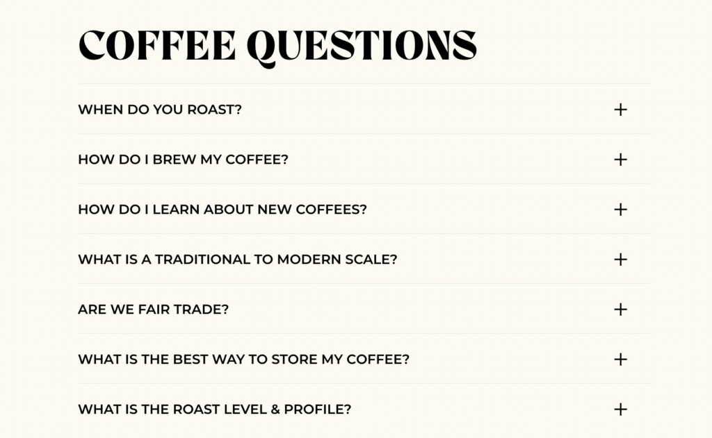
Every ecommerce store should have a frequently asked questions page. It will help you cut down on support tickets while making the shopping experience easier on customers. Unlike shopping in a brick-and-mortar store, there’s no sales associate to ask questions when shopping online. With an FAQ page, you can ensure common customer questions are answered in a straightforward and helpful way.
3. Help Desk & Customer Support landing pages
Clear customer communication through landing pages is possible with a virtual Help Desk and Customer Support pages. While Customer Support aims to connect your team with customers, whether through a virtual chat, email, or on the phone, a Help Desk offers more of a self-serve option when it comes to supporting customers.
Both are valuable to have with an online store—and with a dedicated landing page customers should be able to easily navigate to find the help they need. Consider integrating with Gorgias to provide top-notch customer support, without straining your current Support team.
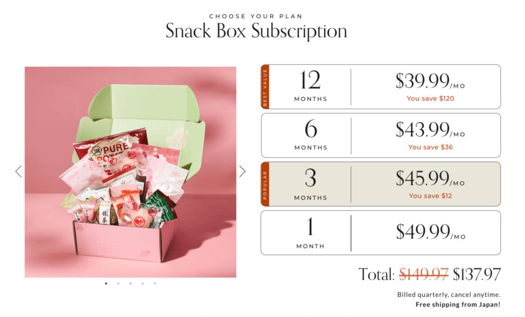
4. Subscription landing page
A page all about subscriptions is a non-negotiable landing page for ecommerce stores that offer subscription options. Many shoppers who are curious about your subscriptions will be looking for more information—especially before they commit to making recurring purchases with your brand. For this reason, having a landing page dedicated to your subscription program is essential.
You should include the following information on your subscription landing page:
- Subscription discounts
- Common subscription plans
- Instructions on how the subscription works
- Shipping rates and applicable discounts
- Images of your subscription box
- Pause and cancellation policies
5. Loyalty program landing page
Though many loyalty programs are free and low-risk to sign-up, customers need to understand how they work in order to reap the full benefits. Explaining how the loyalty program works on a webpage—including its attractive benefits and perks—will give shoppers the confidence to engage with it, and get them excited about it. You can share updates on this landing page and outline how customers can earn points and what they can spend them on, depending on your loyalty program model.
6. Shipping landing page
Shipping information is another vital component of an ecommerce business, and including necessary info for shoppers on a landing page is always a great idea. Consider covering things like:
- Where you ship to
- Common shipping time
- How you ship, including how to recycle or dispose of shipping materials
- How customers can track their orders
7. Return & exchange policies landing page
Last but not least, creating a landing page with return and exchange policies is vital for converting customers. If they’re unsure about your policies, they might be hesitant to make a purchase. Instead, outline everything they need to know about returning or exchanging items, so that they feel at ease making a purchase with your store.
There’s nothing more frustrating than hard-to-find return policies or nonexistent return and exchange policies on a website while shopping. Avoid this frustration with a returns and exchanges webpage that’s easy to find on your site.
Recharge merchants with innovative & effective landing pages
There are a number of Recharge merchants going above and beyond with their website design—including those that have a multitude of helpful and informative landing pages for their shoppers. Not only does it make the shopping experience more interesting and enjoyable, but it can mean the difference between a prospective shopper converting, or leaving your site for a competitor.
Keap Candles
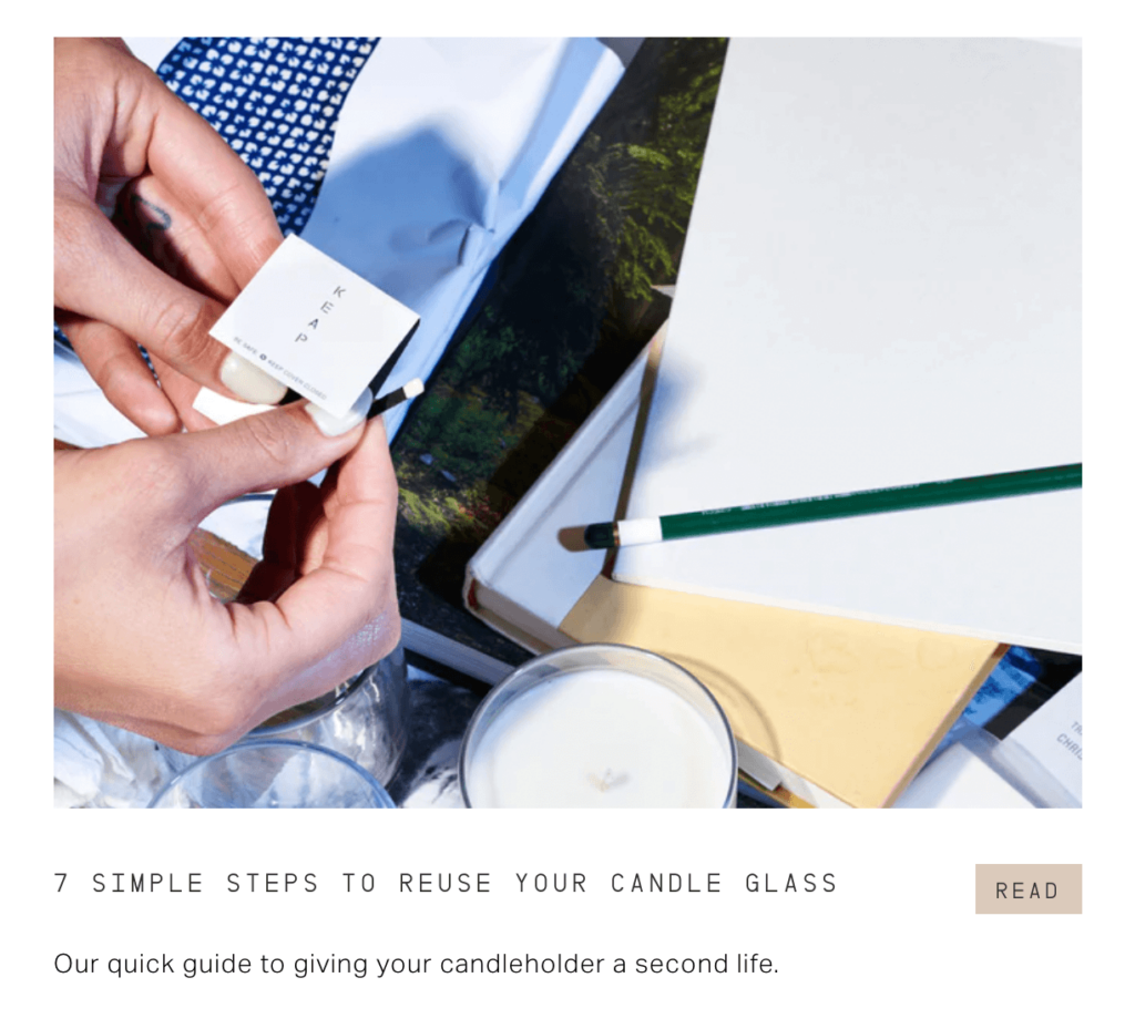
Keap Candles has not only elevated the landing pages game by including beautiful layouts, videos, engaging storytelling, and well-thought-out graphics, but they also have pages that greatly enhance the customer experience for their shoppers.
One of Keap’s main priorities is sustainability. To follow through on this mission, they walk customers through the process of re-using their candle jars, step by step. By doing so, they show subscribers that they’re committed to sustainability, and that they want to help customers be eco-friendly, too, even after they’ve made a purchase.
Bokksu
Bokksu is another Recharge merchant with beautiful landing pages, and they’re a brand that has powerful storytelling in every aspect of their business. One page that stands out on their site is their Makers page. Bokksu is all about Japanese snacks—but not just any old snacks. They source their products for their boxes from local, artisanal makers across Japan.
Bokksu’s Makers page, therefore, dives deeper into these snack makers and makes being a customer so much more than just receiving snacks. Instead, you’re part of the Bokksu story. You’re supporting these makers, many of whom come from family-owned businesses that are many generations old.

Onyx Coffee Lab
When I asked my colleagues about Recharge merchants with great landing pages, Onyx Coffee Lab came up. After browsing through their website, I can see why. The way that Onyx seamlessly blends copy with compelling videos and images shows me they’re so much more than just coffee—they’re all about that experience and ritual we experience every day when we roast our coffee.

Get creative & start seeing results with powerful landing pages
So, don’t underestimate the power of really great landing pages on your ecommerce site. They could truly make the difference between an average and an exceptional customer journey. Plus, they can elevate the customer journey for your subscribers and turn their purchase into more—into an enjoyable and memorable experience that lasts long after their credit card has been charged.

