The stakes are high for product detail pages, especially when subscriptions are involved. After all, these are your brand’s ultimate sales pages. The goal? Get your prospective customer to say yes to the product—and yes to purchasing on subscription.
This page is for persuading. And accomplishing that requires specific strategies. After working with 100+ brands in 20+ industries over a span of 10 years, we’ve found a proven formula for designing PDP pages that convert in a big way.
Buckle up: We’re about to show you five proven tricks for optimizing your product page from the ground up to convert cold browsers into subscription lovers (and loyal fans). It’s not a passing trend—it’s our go-to framework that we’ve developed over the last decade and refined through data testing.
Learn how to sell emotionally and logically with key tactics you can use for your subscribe-and-save product pages. Let’s get to it.
1. Answer the 3 Ps: Product, process & perceived risk
Fun fact: People buy with emotion and justify with logic. Catch their attention, then silence their objections. A correctly structured product page that first sells to your customer emotionally, then leads them through a logical justification of that emotional decision, can overcome most other conversion shortcomings and clear barriers to purchase.
But first, let’s talk feelings. Tapping into emotions on subscription product pages is key, yet often overlooked. Most brands spell out every feature of their product without anticipating how they want their customers to feel when they have it.
Whether you’re selling peace of mind, health, confidence, or ease, if your prospect doesn’t create an emotional bond with your product, you will never make the sale. Create a spark of connection above the fold. Hone in on their emotions by hinting at primary desires. Increased desire comes in the form of wants, solving a problem, or helping your customer envision living a better version of their life with continued use of your product. Edit in the emotion to increase your PDP’s conversion prowess.
Now that you have their attention, sell to them logically. Create a strong argument supported all the way down the page to make every section a complete package of persuasion. Your customer will have questions and concerns about your product, process, and the perceived risk associated with making a purchase. The better you can anticipate and address these 3 Ps, the more likely you will be to convert first-time buyers.
PRODUCT
Many subscription products tend to be consumables in the nutrition or CPG space, or topical items like skincare and beauty products. It’s key to spell out details and anticipate any questions or objections your customer may have early on.
Expect them to be asking:
- What ingredients are in this product?
- Where is it produced?
- Is it certified or authority approved?
- How is this solution better than my current solution?
Address the logical barriers consumers have about your product. Your product page should answer questions about components, direct benefits, care, etc. Logic asks questions like, “Does this product have safe ingredients?” “What’s the shelf life like?” Make sure customers know everything they need to know about your subscription product to help them feel confident.
PROCESS
Your product page should include information about every detail in the process, from purchase to use cases. Shipping, returns, warranties—anything that relates to the way you are going to deliver your product and how it should be used or consumed when it arrives should be explained on the page.
Often, purchases are time-sensitive. Your customer needs to know that the product they want to order will arrive in time for that trip, birthday, or special occasion. How much are customers getting in each shipment, and when should they expect it to arrive? How often should they use or consume it for the max benefits? All are important questions to answer.
PERCEIVED RISK OF PURCHASE
Conversion tip 101: Persuade your customer with proof that your subscription product will work, and that it’s backed by authority and community reviews.
Include elements like inspiring testimonials, press, social proof, user-generated content (UGC) from influencers, reviews, warranties, guarantees, and customer-centric shipping and returns policies. Little stories of transformation make a difference: They’re real, they’re believable, and they align with what the person on your page actually wants—another key piece for increasing that emotion.
2. Excite & engage with social proof
You won’t sell anything if your PDP doesn’t build trust. It’s critical when planning your product page that you strategically include proof that backs up your claims.
That proof will make your prospect’s skeptical subconscious say, “I can trust what you’re saying.” You can include social proof, like testimonials; industry proof, like “featured in Outside Magazine,” or a product demonstration.
Now here’s the trick: For every all-important emotional connection to happen, your proof must align with your messaging.
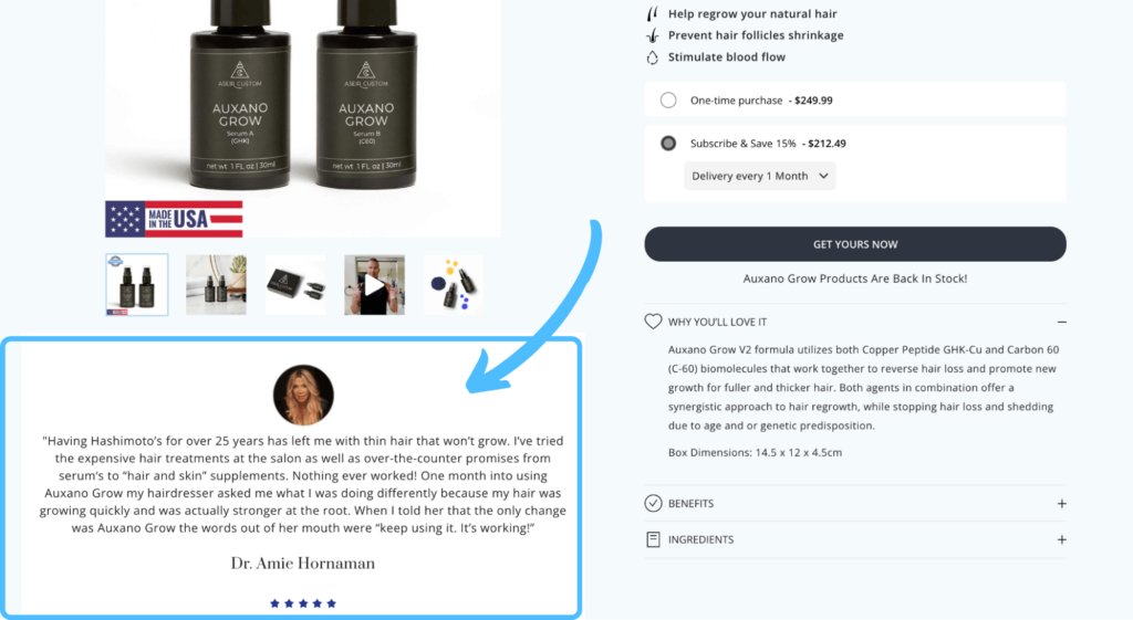
How do you get people to believe what you’re saying? How do you get them to trust that your message is accurate? Ensure the proof is backing up the claims that the rest of the section makes. Do this with FAQs and specific testimonials to give those wanting in-depth information what they need without requiring them to leave your PDP to find it.For example, if the section you’re working on shows that your product is made with simple organic ingredients, the unquestionable proof could include photos of the ingredients, information about who formulated it, and testimonials that show people loving the product because of this. The ingredients can be a mechanism for how the product works. Always throw in a testimonial that is specifically curated to the section.
3. Optimize your image gallery
Every part of your subscription product page should bring that product into real life, and move the customer to the cart. Your images are an integral part of this PDP structure. They should intentionally frame and support your key message and reflect your use cases.
Focus on producing high-quality imagery, and use both product and lifestyle photos to tap into emotions. Let your customer envision themselves living that better version of their life with your subscription product!
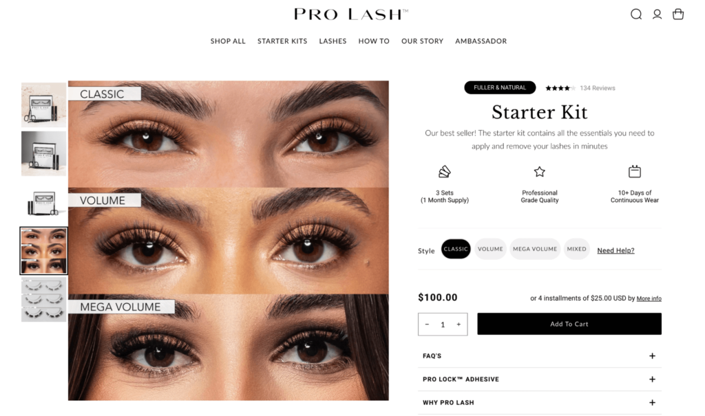
Don’t have a lackluster photo taking up space. Make every image part of your persuasion package.
4. Keep your benefit verbiage clear
Sell the benefits and end results of your products, not their features. Even better: Heighten the emotion in your copy by transforming your product features into benefits. It’s paramount that you talk about the benefits of subscribing in an easy-to-consume, bite-sized way. Use page elements like iconography to showcase product benefits and offer customers a call to value before they add an item to their cart. You want the information to be extra accessible, especially for those on a mobile device.
Now, for a subscription-specific example, let’s say you sell women’s supplements. Your prospective customers are health-conscious, nutritionally savvy, and use your products daily. This makes it especially important to get specific with your copy. Instead of verbiage like “subscription” and “recurring every 90 days,” communicate the direct benefit they can expect with your bundle plan: “Delivered to your door every 90 days.” This eliminates the anxiety of running out of something that will directly benefit their health and peace of mind.
Also: Does the copy paint a picture of consequence or dream state? Your job in the above-the-fold section of your product detail page is to escort the ready-to-buy prospect to the cart. This means that your imagery, product description, and button copy should include the assurances, subscription offer, reflection of what they need, and a believable promise that your product will fulfill those needs before your customers scroll the page.
To recap, keep copy short and punchy, anticipate and clarify benefits to increase motivation, and offer assurances. Now, go make those prospective customers feel something. It’s a key lever for conversion.
5. Use percent savings > dollar savings
In a recent test, we found when we rejected best practices and used percentage savings (vs. dollar savings) on one of our client’s subscription product pages, we saw a 27% increase in conversions.
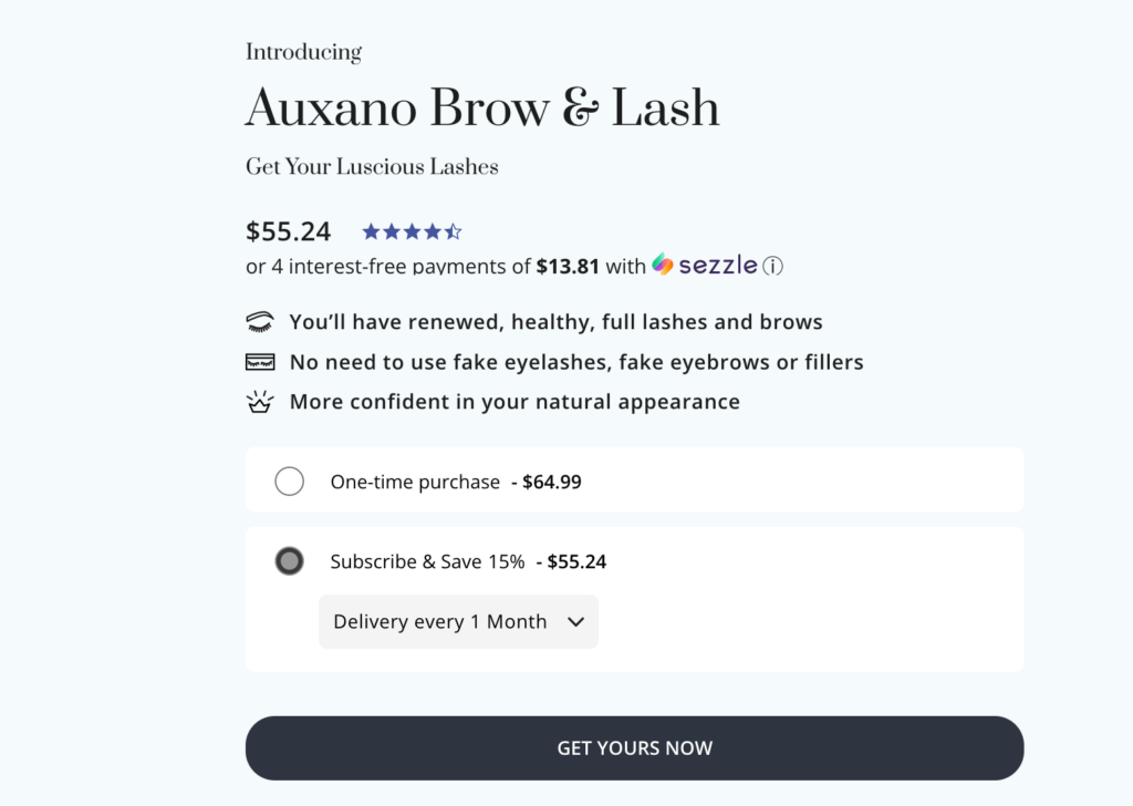
Typically, if your product is priced over $100, you’re better off showing a flat savings amount in dollars instead of a percentage. This is the standard “best practice” in the ecommerce world.
But, in this instance, showing the percentage-off savings for our client’s subscription bundle resulted in a wildly improved conversion rate. The more you can simplify their savings, the more likely those savings are to guide them toward a purchase. This is true across the board. Sometimes, switching up how you communicate these savings can be the best possible way to reach your audience. We’re all about going against the grain at Blue Stout, as long as we test wherever possible.
We hope these tips take the guesswork out of design and strategy, and show you exactly what you should be optimizing when it comes to your subscription product pages. Follow these tactics, and you’ll be well on your way to creating strategically planned, framework-informed pages.
These five tips are just a few of the guidelines Blue Stout uses daily to increase conversion rates, AOV, and repeat purchases for our clients. Want our full framework? Download the full PDF guide, follow us on Twitter for actionable tips, and sign-up for our newsletter to get proven tactics in your inbox every Wednesday.
