Food and beverage subscriptions are satisfying the cravings of consumers across the globe. From weekly meal kits to monthly coffee deliveries, whisky to wine, and pasta packages to vegetable boxes, tasty goods are arriving at our doorsteps on an increasingly regular basis.
Convenient, customizable, and cost-effective, food and drink subscriptions have become a much-loved fixture in consumers’ daily lives. In fact, research by Recharge shows that despite the post-pandemic return to in-store shopping, food and beverage subscription brands enjoyed a 51% increase in average monthly subscribers in 2021, as well as 77% growth in monthly recurring revenue.
The importance of trust in online food & beverage sales
Trust is a key ingredient in the recipe for a successful food and beverage subscription website. First-time shoppers might be particularly cautious about purchasing edible products online, especially if they’re committing to a long-term subscription rather than a one-time purchase.
And it’s not just important when you’re acquiring new subscribers. Trust is something you’ve got to maintain throughout a customer’s relationship with your brand if you want to secure their loyalty and encourage advocacy.
Ultimately, you need to make consumers feel confident signing up for a subscription—and continuing it, too. How? By proving to them that you’re a credible business with quality (and tasty!) products and happy subscribers at your core.
4 trust-building tactics for your food & beverage subscription site
Earning and nurturing trust is the combined result of multiple actions, four of which we’ll explore now.
1. Clear & useful information around products & plans
It’s important to provide detailed information about your products so that potential customers are clued up on exactly what they’re buying. This is particularly crucial in the food and beverage industry, as consumers need clarity around things like allergens, expiry dates, and storage.
You should:
- Clearly list all the ingredients, highlighting any allergens;
- Be transparent around nutritional information;
- Point out recommended portion sizes;
- Include storage, preparation, and cooking instructions, if relevant; and
- Explain how your products will be packaged and shipped (especially important for items that need refrigerating).
A combination of detailed product descriptions, engaging visuals, and informational videos will enable consumers to make informed decisions based on their personal tastes and dietary needs.
As an example, look how nutritional powdered food brand Huel clearly communicates the nutritional information of a Huel Bar on their product page. Small things like this speak volumes about the brand’s commitment to its customers and its credibility as an established retailer.
It’s not only your products you need to provide details about. It’s crucial that you set customers’ expectations and explain exactly how a subscription from your brand works. Clarity and transparency are key for gaining trust and making consumers feel more secure about their repeat purchase.
Consider creating a subscription landing page that:
- Clearly sets out exactly what’s included in one delivery (don’t forget that all-important “what’s in the box photo” here);
- Clarifies how often a subscriber will receive a delivery;
- Explains how they can edit, pause, skip, or cancel their subscription;
- Details your returns policy;
- Explains how and when subscribers will be charged; and
- Anticipates any questions or concerns (this will put consumers at ease and increase their confidence in signing up for a subscription).
Union Hand-Roasted Coffee uses icons to let consumers know what to expect in each subscription box:
2. High-quality imagery
It goes without saying that high-quality ecommerce photography is a key trust signal on any online store, but especially when you’re selling products that subscribers will be eating and drinking.
While mediocre images can instantly trigger distrust amongst site visitors and devalue your products, first-rate photography will capture attention, evoke the senses, and leave consumers hungry for more, all while portraying your brand as a credible retailer.
To achieve this, your photos should:
- Be clear, crisp, and well-lit;
- Be consistently-styled;
- Use freshly prepared food or drinks;
- Include props to add context;
- Showcase multiple angles;
- Identify key ingredients; and
- Be given plenty of real estate across your subscription website.
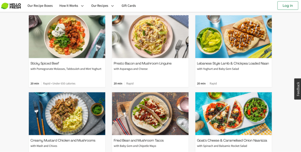
Global meal kit subscription brand HelloFresh has curated a library of vibrant, mouth-watering, professional ecommerce photographs to build trust with would-be subscribers.
3. Social proof
Social proof—things like reviews, user-generated content (UGC), and third-party endorsements—can be a powerful tool in demonstrating your brand’s worth and building consumers’ trust in your subscription products.
We humans are wired to trust (and buy from) brands if we can see that other people view them favourably. In fact, analysis by Yotpo found that people who look at UGC convert 161% more than those who don’t.
Here are a few ideas to help foster trust and turn browsers into buyers:
- Place reviews in a prominent position on your homepage, product pages, and key landing pages;
- Proudly display media mentions and awards on your homepage (have you been featured in any industry magazines, or even endorsed by a celebrity?);
- Include average star ratings for products;
- Feature an on-site gallery of your customers’ culinary creations; and
- Integrate your Instagram feed on your ecommerce store’s homepage and make it shoppable.
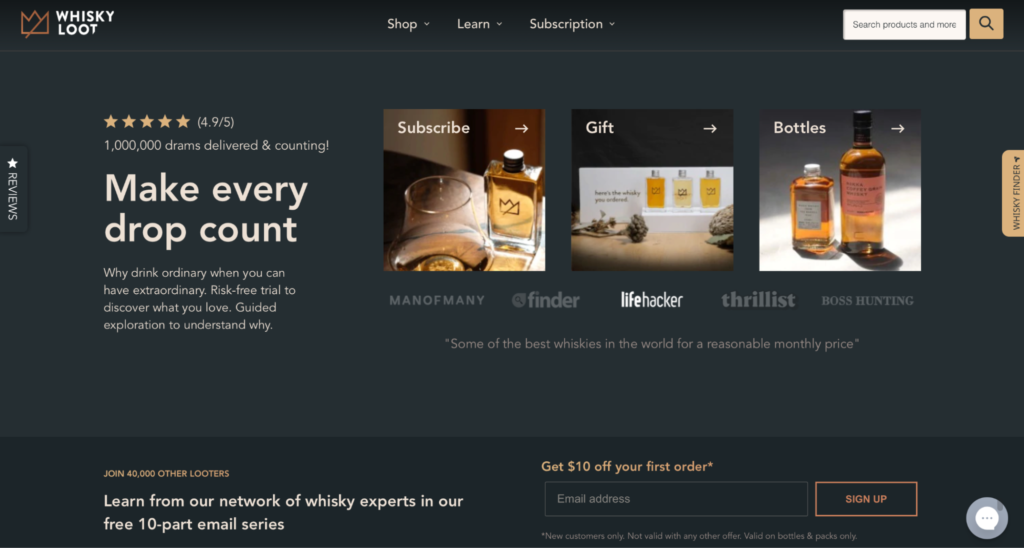
One brand who has successfully elevated their ecommerce site with social proof is Australian subscription brand Whisky Loot. Not only do they display an average rating and highlight media mentions, they demonstrate just how popular their subscription is by indicating how many drams of whisky have been delivered and how many subscribers they have—all above the fold on their homepage!
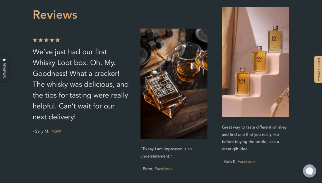
Further down their homepage, they also have a section dedicated to customer reviews:
4. Full control over subscription management
We know that consumers are hungry for flexibility when it comes to their subscriptions. They want options—around product, delivery cadence, payment methods, and so on.
When subscribing to consumables like food and drinks, which don’t get used at a blanket rate, it’s particularly important that customers can quickly and easily edit, skip, pause, and restart their subscription, depending on their needs.
Giving your subscribers access to an intuitive customer portal that puts the power in their hands shows empathy for your customers and their desire for flexibility and customisation. This will help to build trust and secure loyalty amongst your subscribers, and save your team valuable admin and customer support time.
Although it may seem counterintuitive, you should also make it straightforward for subscribers to cancel a subscription altogether. Knowing that there’s an accessible cancellation option at their fingertips will dispel customers’ fears, making them feel much more comfortable about signing up for the long haul.
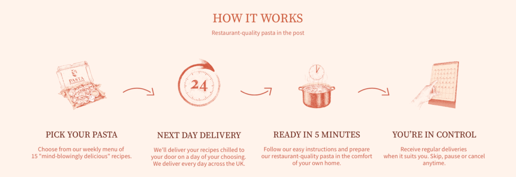
Popular pasta recipe box brand Pasta Evangelists has ticked this box by reassuring consumers at various points across their website that they can skip, pause or cancel at anytime, like in this “how it works” visual:
Get the recipe for food & beverage subscription success
This article is based upon an original article on the Swanky blog. To read more, please check out The Key Ingredients of a Successful Food and Beverage Subscription Website.
Swanky is a leading international ecommerce agency that specialises in designing, building and growing Shopify Plus stores for ambitious enterprise brands. They’re trusted to deliver best-in-class D2C subscription solutions for clients across the globe, with a food and beverage brand portfolio including industry-leading names like HelloFresh, Pasta Evangelists and Huel.

