When starting and optimizing your subscription business, there are a few mistakes you’ll want to avoid. Identifying what will make for a bad user experience and pinpointing where customers will churn can help you determine what needs to be done in order to increase your customer retention rates and lifetime value (LTV).
Customers can churn at any moment, so going through the shopping experience as if you were a shopper yourself can help you identify the areas where people may drop. The entire user journey—from their arrival to your website to checkout to managing their own subscriptions—is important. How people interact with your brand could be the difference between winning a subscriber for life, or losing someone to a competitor with a better user flow.
Hosting a bad user experience
When it comes down to it, the user experience is a highly valuable part of finding subscription success. Many shoppers leave subscription services simply because they are frustrated by their customer journey. If your website is hard to navigate, or necessary information is missing, customers will close out of their browser and move on. The user experience begins the moment a customer reaches your site and should be straightforward and easy to navigate.
When you think about user experience, you should always have the end user in mind. In this case, your end users are your subscribers. To get a good idea of how your website—a vital part of the customer journey—is performing, try these tactics:
- Perform usability tests
- Create focus groups of potential customers
- Conduct user interviews
Listed below are some of the common subscription pitfalls related to the user experience that you’ll want to avoid when creating and managing your subscription business.
Creating a subscription schedule that doesn’t make sense
When your customer base is entertaining the idea of committing to a subscription service, they have to know if it’s going to be worth their investment and if it will fit into their current schedule. Subscriptions—especially in the Health & Beauty and Pets & Animals verticals—need to make sense based on customers’ needs, including those of their family and their pets. Offering too few options for delivery can turn away potential users of your product.
To build the most useful and enticing subscription schedule, try enlisting feedback from your customers or creating a product recommendation quiz to help shoppers determine the best subscription choice for them. Building this into the user experience makes it part of the educational journey for new subscribers—they can learn more about your products and offerings through this process.
Each product has a unique schedule that will depend on the customer and their lifestyle and choices. People who travel often might need to skip a shipment. Or, maybe they’d like to try a new product and see how they like it for their next subscription cycle. Allowing for maximum customization in scheduling subscriptions will help your business remain attractive to customers for a long time.
Not investing in your customer portal
Probably the biggest touchpoint for your subscribers in terms of their user experience is the customer portal—the secure hub where customers go to manage their subscriptions with you. It can make or break your subscription services. A customer portal that’s hard to navigate means usability issues and an increase in customer support tickets. Instead, invest in your customer portal’s interface design and interactive features to create meaningful and relevant experiences for your subscribers.
There are a number of areas within the customer portal that you’ll want to invest in—making the customer experience better and optimizing user experiences go hand in hand. How the user interacts with your portal will make all the difference.
Skips & swaps
Within your customer portal, subscribers should be able to easily skip shipments and swap products when they want to. Merchants who make it easy for subscribers to do this end up keeping their customers around longer because people appreciate the flexibility of fitting subscriptions into their life, exactly how they want.
Bundling
Bundling products is another crucial way merchants can optimize their user experience. By giving shoppers the ability to make their own subscription box or a mix of the products they need, you are creating an attractive service for them. Ensure that portal users know how to do this by making it clear and easy to add other products.
Cross-sells & upsells
Creating a better user interface can also mean increased revenue when done correctly. Cross-selling and upselling can help your users find new products, and increase their average order value (AOV). To do this, give customers the option in your customer portal to add products on a subscription or upgrade an item for a more premium version.
Loyalty programs
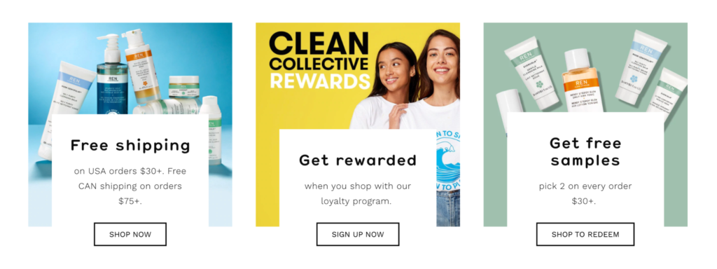
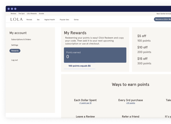
Merchants can also go the extra mile by creating loyalty or points programs that customers can view from their portal to make them excited about shopping and spending more money in your online store. When a person feels motivated to earn points or reach the next level, they’ll end up purchasing more to reach that goal.
Neglecting SMS opportunities
Instead of sending emails at a high frequency, consider integrating with a transactional SMS service such as RechargeSMS. SMS integrations allow customers to manage their orders straight from their phone, without the hassle of logging in to their customer portal.
Transactional SMS enables customers to:
- Get reminders and easily modify orders
- Swap products
- Add a one-time purchase
- Skip or delay shipments
If you haven’t implemented transactional SMS yet, let the research speak for itself: Enabling SMS communication can increase customer LTV by up to 30%. Creating this all-encompassing digital experience for your customers, with instant connection through text messaging, can mean huge gains for your business.

Avoid subscription mistakes by optimizing the user’s experience
When managing your subscription business, there are a number of strategies for optimizing user experience and therefore increasing customer satisfaction and loyalty. The visual design of your website and customer portal, along with their functionality, are important factors for success.
User research (also referred to as UX research) can help merchants determine the best design elements, user interfaces, and features for subscribers. A user-centered design that incorporates human factors and allows users to play a critical role in how the website and customer portal are designed will lead to better functionality overall.
Additionally, creating subscription schedules that make sense and integrating transactional SMS into your overall strategy will help optimize the user experience and create positive emotions when customers interact with your brand.
