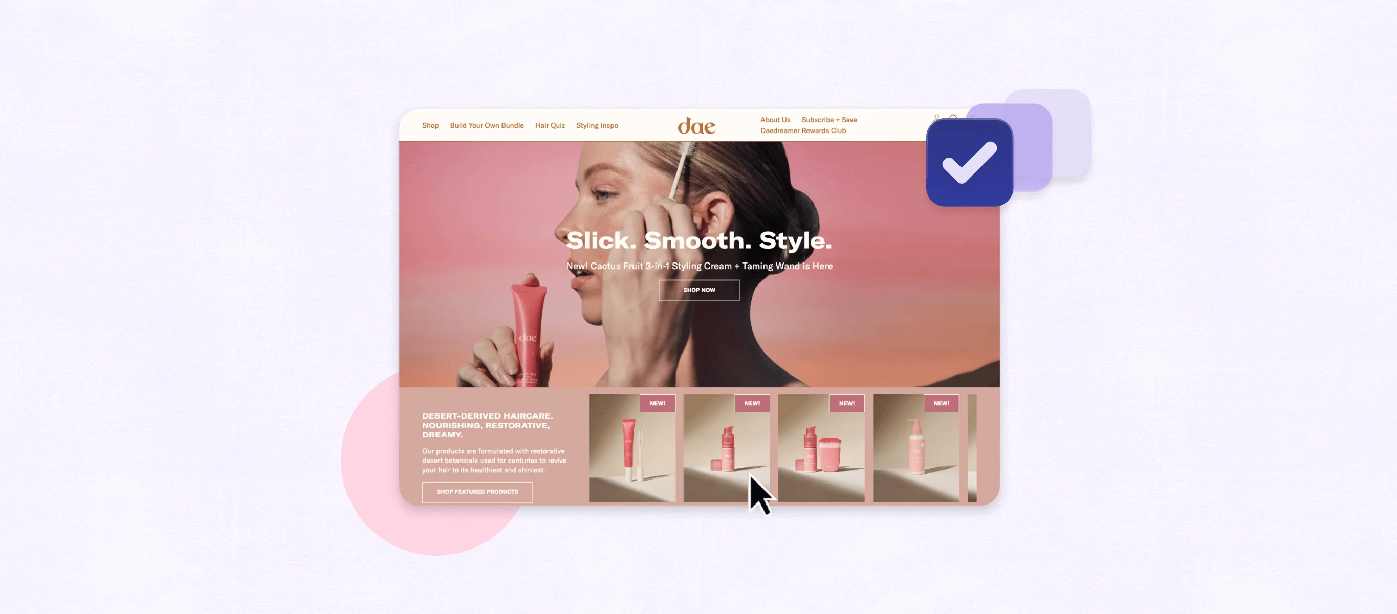
From transactional touchpoints to subscription management, every interaction with a subscriber should be intentional and on-brand. Through developing voice, clarifying image, and defining the mission, you create a recognizable and compelling story. Bringing this overarching brand to every step of the customer journey promotes awareness, boosts engagement, and increases lifetime (LTV).
Recharge offers a few turnkey opportunities to showcase your brand throughout the customer journey—customizing the look and tone of transactional notifications, tailoring brand-relevant cancellation reasons and retention strategies, and stylizing the customer portal for subscription management. How can you maximize these moments to make an impact on customers? Let’s walk through it.
Transactional notifications
By default, Recharge deploys transactional notifications based on an event, whether that’s a subscription activation, upcoming order, or a failed transaction. The turnkey style of these notifications is basic text with no imagery or major call-to-action. However, with a little CSS, you can flex your voice with an impactful touchpoint, encouraging customers to manage subscriptions, adjust shipping/billing and learn more about your brand. Craft well-designed and powerful messages with Recharge variables and CSS in Settings > Notifications.
If you’re integrated with Klaviyo, you can deploy some transactional messages through its platform instead. Going this route gives you the benefits of Klaviyo metrics and designed email templates.
Cancellation reasons + retention strategies
Recharge provides generic cancellation reasons with a comment field in your settings. You can tailor cancellation reasons to match your brand’s voice and your product so that your subscribers aren’t automatically selecting the vague “Other” reason. By offering relevant cancellation reasons you will acquire actionable insights from your subscribers. Having this data positions you to understand your customer churn and make changes as needed to improve retention. Additionally, you can enable incentives or actions to encourage customers to change their subscription instead of canceling, like providing a discount code or a skip option.
Customer portal
The customer portal gives customers control of their subscriptions, empowering them to make changes to upcoming orders. To ensure the experience is on-brand and frictionless, Recharge offers two customer portal themes, Prima and Novum, which provide varied user interfaces to meet your business and platform needs. With both options you can leverage CSS to customize the header, footer, and credit card page, creating brand cohesion and familiarity across all aspects of the customer experience. In addition to stylizing, you can use translations to make adjustments to the language and text elements to fit the rest of your site. These modifications can be made in Settings > Customer portal > Customize styles and in Settings > Translation.
For more robust customizations, you can build a completely custom interface using Recharge Theme Engine. While this isn’t available turnkey, investing in your customer portal can dramatically improve retention and offer creative ways for subscribers to engage.
Customize for an exceptional customer journey
Recharge offers flexibility to customize aspects of your customer journey, so every detail can be refined and relevant. When your subscribers have a consistent experience, they interact with your brand as a strong, stable force. Every touchpoint offers an opportunity to harness the power of your brand, and creating lasting relationships with customers.


