The “Add to Cart” button is one of the most crucial elements on any ecommerce site. It’s not just a button; it’s a gateway to conversions, customer satisfaction, and ultimately, revenue. For brands looking to optimize their “Add to Cart” rate, you’ll be looking to land on a number between 8-11%.
Mastering the opportunities around this small but mighty feature can significantly impact your business’s success. In this article, we’ll explore six key opportunities to enhance the “Add to Cart” experience, turning casual browsers into loyal customers.
Key takeaways
- Optimize the 'Add to Cart' button with clear, compelling CTAs and strategic design and placement to enhance visibility and usability.
- Enhance customer confidence by providing detailed product information, customer reviews, and flexible payment and shipping options.
- Increase average order value and reduce cart abandonment through effective cross-selling, upselling, and a simplified checkout process.
How do you calculate your “Add to Cart” rate?
To calculate your add-to-cart rate, divide the total number of sessions for your ecommerce site where a shopper adds an item to their shopping cart by your site’s total number of sessions, and then multiply that number by 100 to get a percentage. Keep in mind that this metric can vary over time due to factors like promotions, seasonality, and changes in website traffic. It’s important to calculate and analyze this rate over consistent periods, such as weekly or monthly, to gain accurate insights into your site’s performance.
Key opportunities to optimize your rate
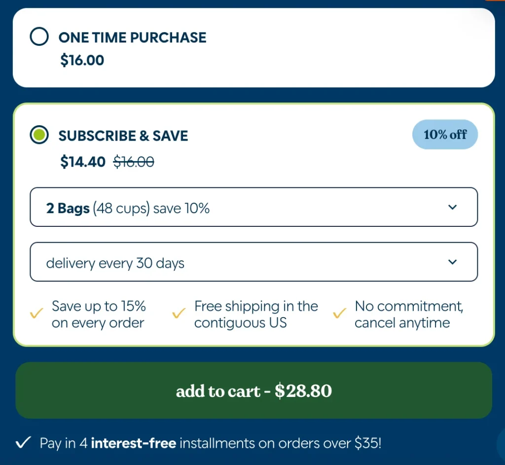
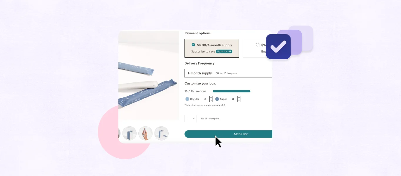
Optimizing the design and placement of your “Add to Cart” button is a critical factor in driving conversions on your e-commerce site. A well-designed and strategically positioned button can significantly increase the likelihood that visitors will take the next step toward making a purchase. In this section, we’ll explore various tips to enhance the visibility, size, shape, and placement of your “Add to Cart” button, ensuring it effectively captures customer attention and encourages action.
1. Optimize button design and placement
The design and placement of your “Add to Cart” button play a pivotal role in driving conversions. Here are some tips to optimize these aspects:
- Visibility: Ensure that the button stands out on the page. Use contrasting colors that draw attention without clashing with your site’s overall design.
- Size and Shape: Make the button large enough to be easily clickable on both desktop and mobile devices. Rounded edges can often make buttons appear more inviting.
- Placement: Position the ‘Add to Cart’ button prominently near the product details and price. It should be one of the first elements users see when they decide to make a purchase.

2. Clear and compelling call to action
A clear and compelling call to action (CTA) can significantly boost the effectiveness of your ‘Add to Cart’ button. Consider these strategies:
- Wording: Use simple, action-oriented language. Phrases like “Add to Cart,” “Buy Now,” or “Get Yours” are straightforward and effective.
- Urgency and Scarcity: Incorporate elements of urgency or scarcity, such as “Limited Stock” or “Only a Few Left,” to encourage immediate action.
3. Provide product information and reviews
Customers often need reassurance before adding items to their cart. Providing detailed product information and customer reviews can help:
- Customer Reviews and Ratings: Display customer reviews and ratings prominently. Positive feedback from other customers can significantly influence purchase decisions.
4. Offer flexible payment and shipping options
Flexibility in payment and shipping options can be a decisive factor for many customers. Here’s how to enhance this aspect:
- Multiple Payment Methods: Offer a variety of payment methods, including credit/debit cards, digital wallets, and installment plans. The more options you provide, the more likely customers will complete their purchase.
- Shipping Choices: Provide multiple shipping options, from standard to expedited delivery. Display estimated delivery times and costs upfront to avoid surprises at checkout.
5. Implement cross-selling and upselling
The ‘Add to Cart’ moment is an excellent opportunity to increase average order value through cross-selling and upselling:
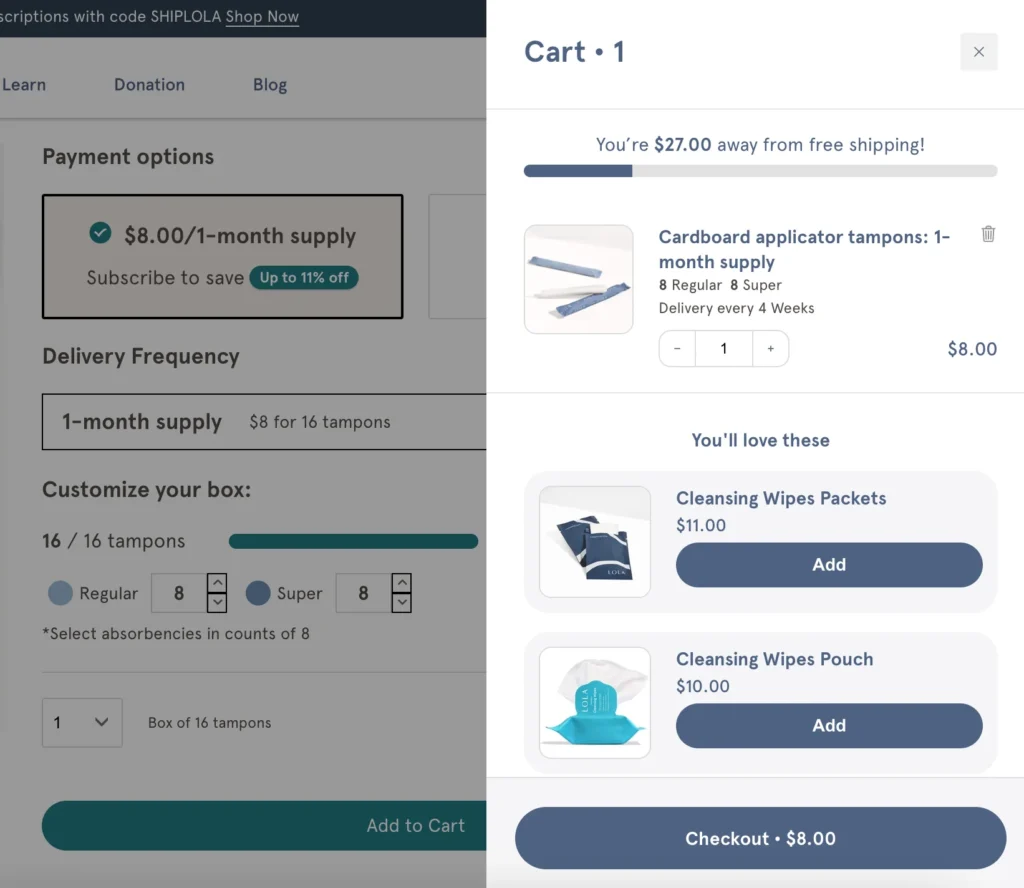
- Related Products: Suggest related products or accessories that complement the item being added to the cart. For instance, if a customer is buying a laptop, recommend a laptop bag or a mouse.
- Upgrades: Offer premium versions or bundles of the product at a slightly higher price point. Highlight the additional benefits to make the upgrade appealing.

6. Simplify the cart and checkout process
A streamlined cart and checkout process can reduce cart abandonment and enhance the overall shopping experience:
- Cart Summary: Provide a clear and concise summary of the items in the cart, including images, quantities, and total price.
- Guest Checkout: Allow customers to complete their purchase without creating an account. Offering a guest checkout option can speed up the process and reduce friction.
- Progress Indicators: Use progress indicators during the checkout process to show customers how many steps are left until completion. This can make the process feel more manageable and less daunting.
Enhance the customer journey for sustainable growth
Mastering the “Add to Cart” experience involves more than just a well-placed button. By optimizing its design, crafting compelling CTAs, providing detailed product information, offering flexible payment and shipping options, leveraging cross-selling and upselling opportunities, and simplifying the checkout process, you can significantly enhance the shopping experience and drive conversions.
Each of these opportunities requires attention to detail and a focus on the customer journey. Implementing these strategies effectively can transform casual visitors into committed buyers, ensuring sustainable growth for your ecommerce business.
Sources
[1] Key Add-to-Cart Conversion Rate Statistics (2024) (Blog)


